
Moselschatz logo design
Moselle treasure — a logo to melt away.
What does a logo taste like chocolate? We asked ourselves exactly this question when we embarked on a journey to a new brand identity together with Moselschatz. The result: an iconic “M” that combines pleasure, craftsmanship and home in an elegant twist.
At the center of the design is the Moselle loop — not as a map, but as a soft, flowing line that fits smoothly into the logo. Curves such as melt-in-the-mouth chocolate, typography with lots of air and lightness, and color combinations that are reminiscent of a variety of varieties: The logo is as individual as the chocolates themselves — and yet recognizable in every element.
The process was characterized by many variants, great attention to detail and a clear vision:
A brand identity that doesn't scream loudly, but quietly seduces.
Moselschatz is not simply a chocolate brand — it is a moment of pleasure with its own signature. And now also with a logo that makes this moment visible.
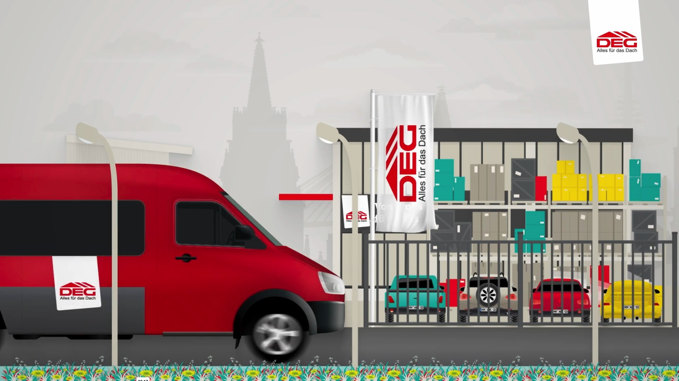
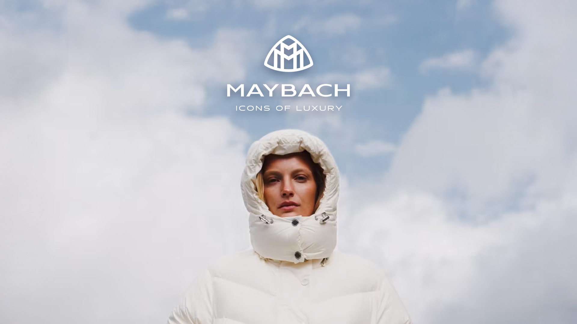
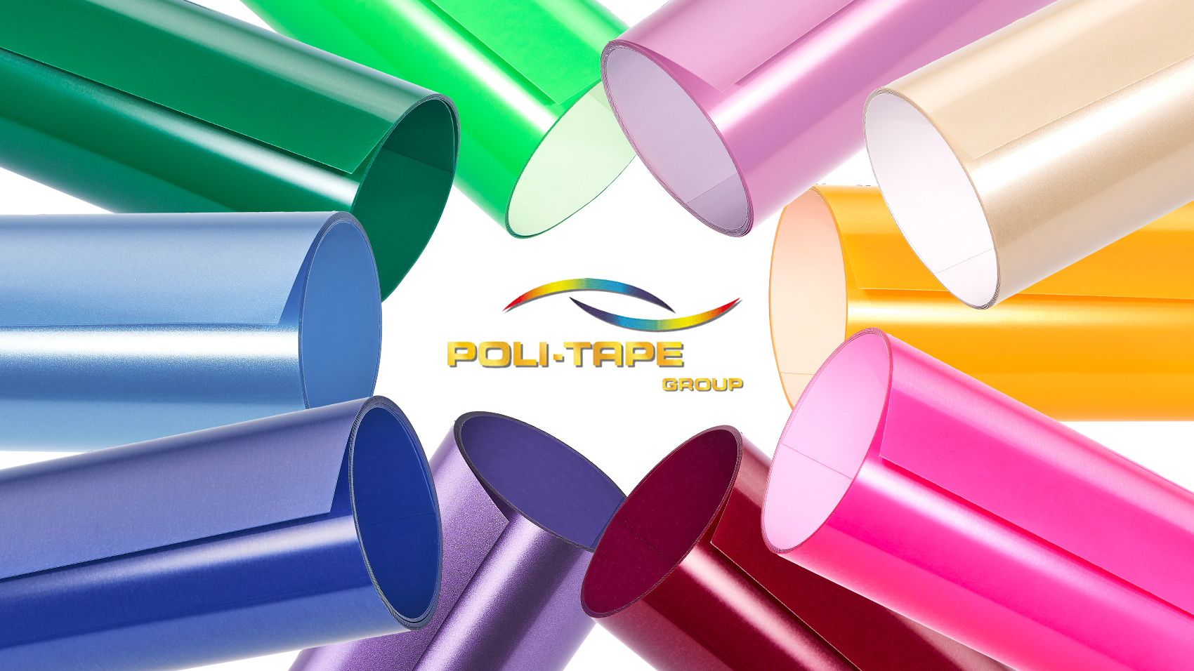
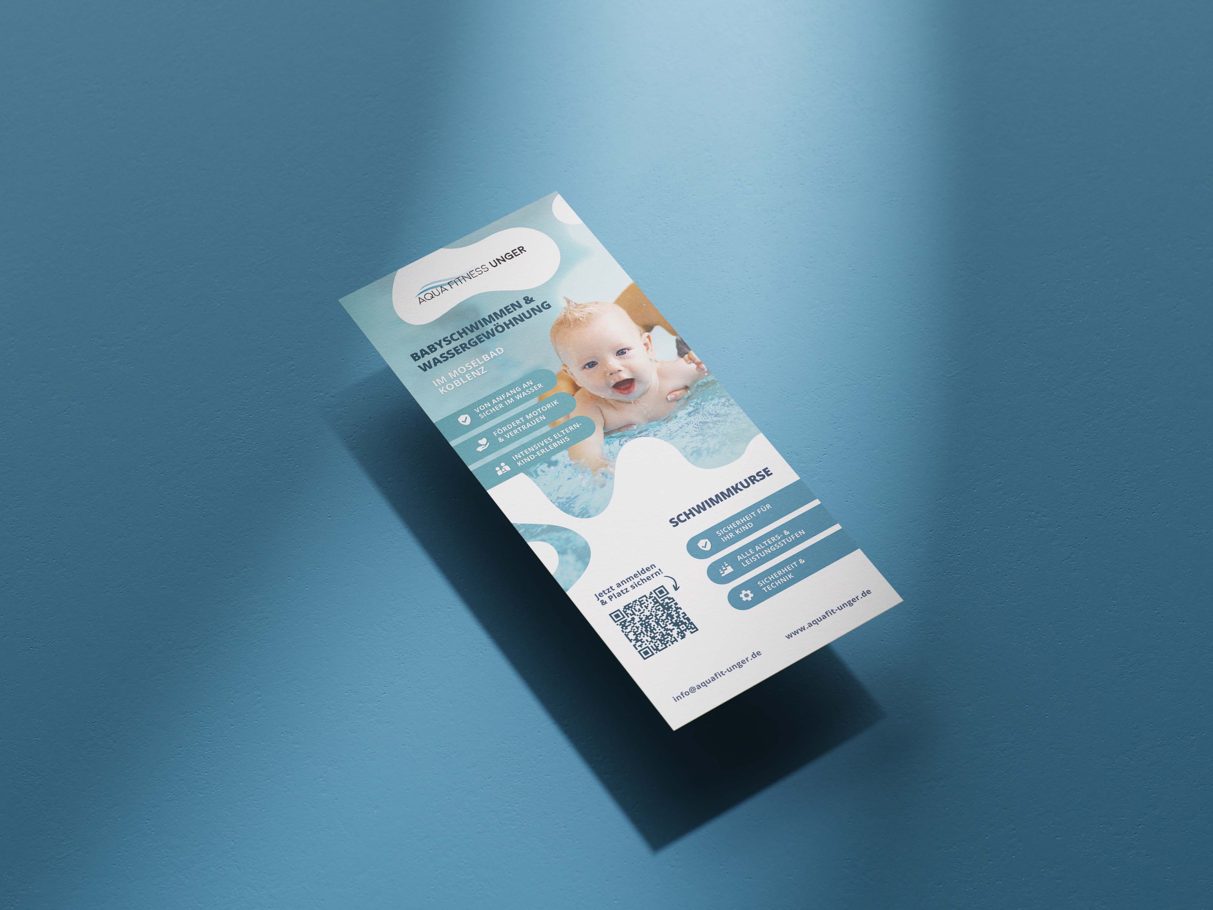
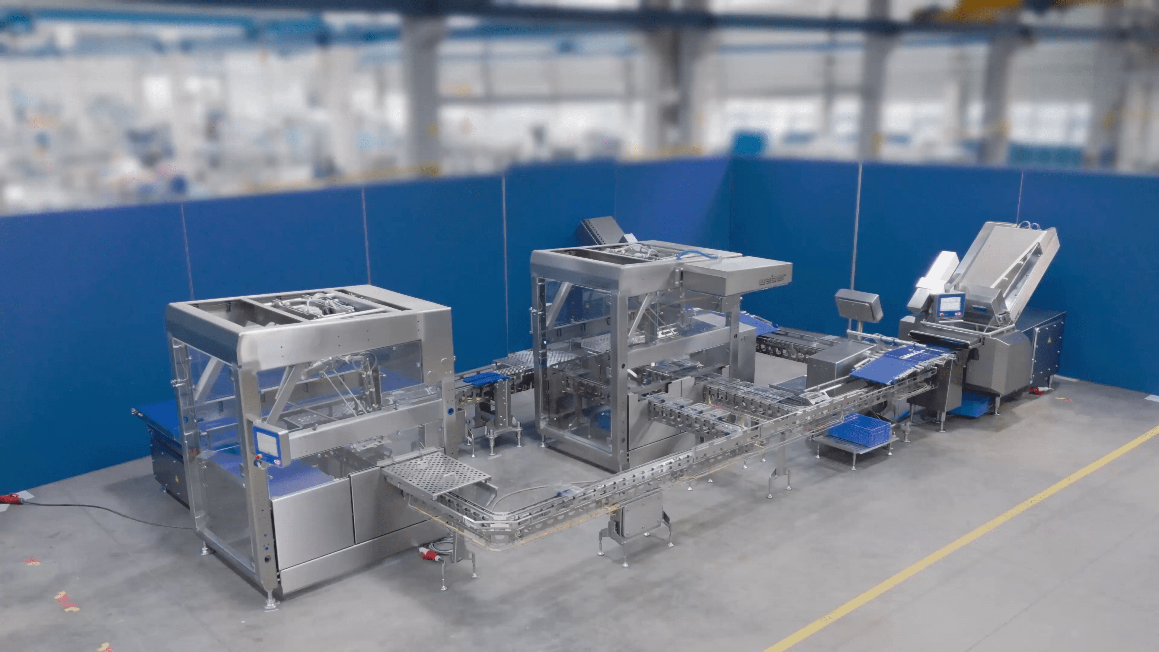
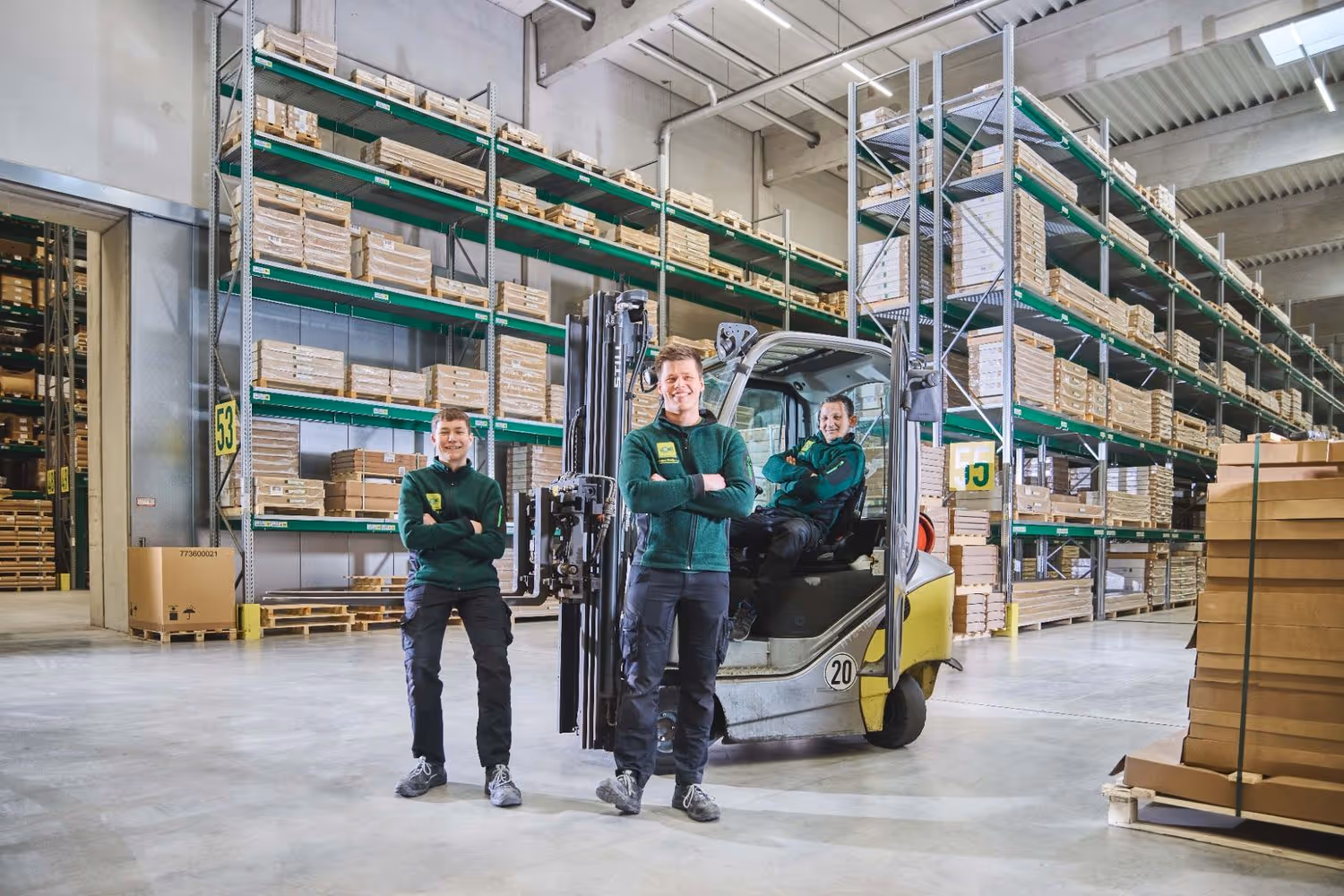
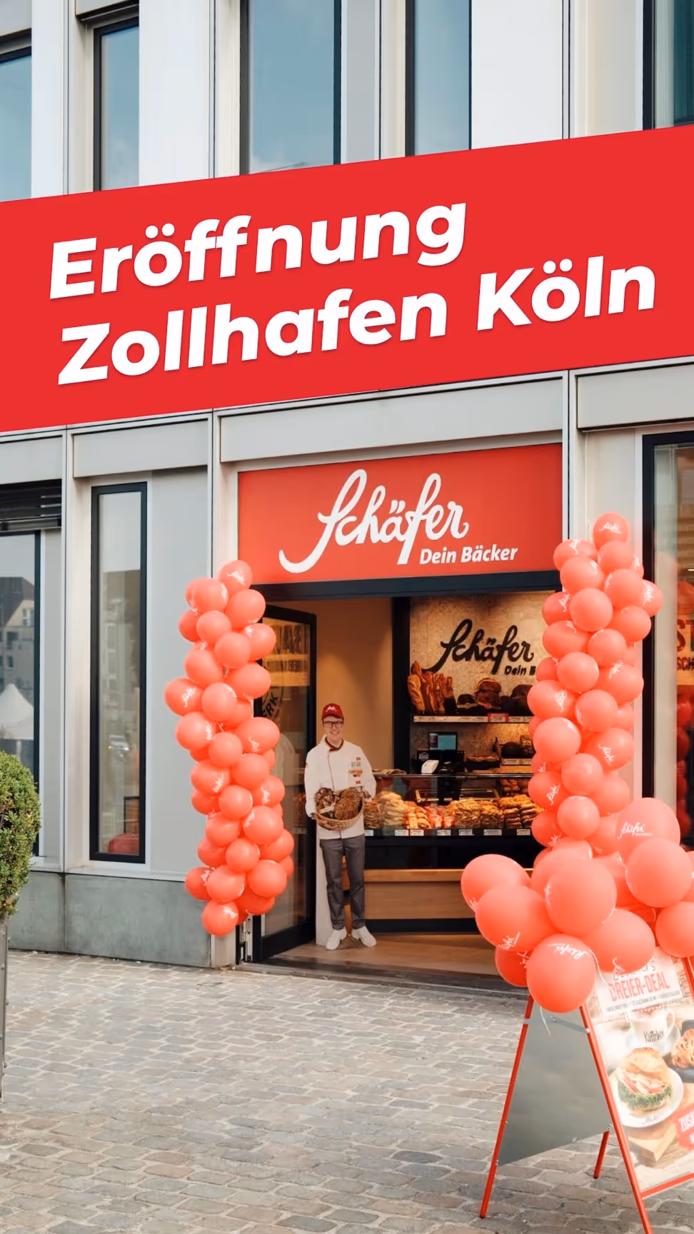
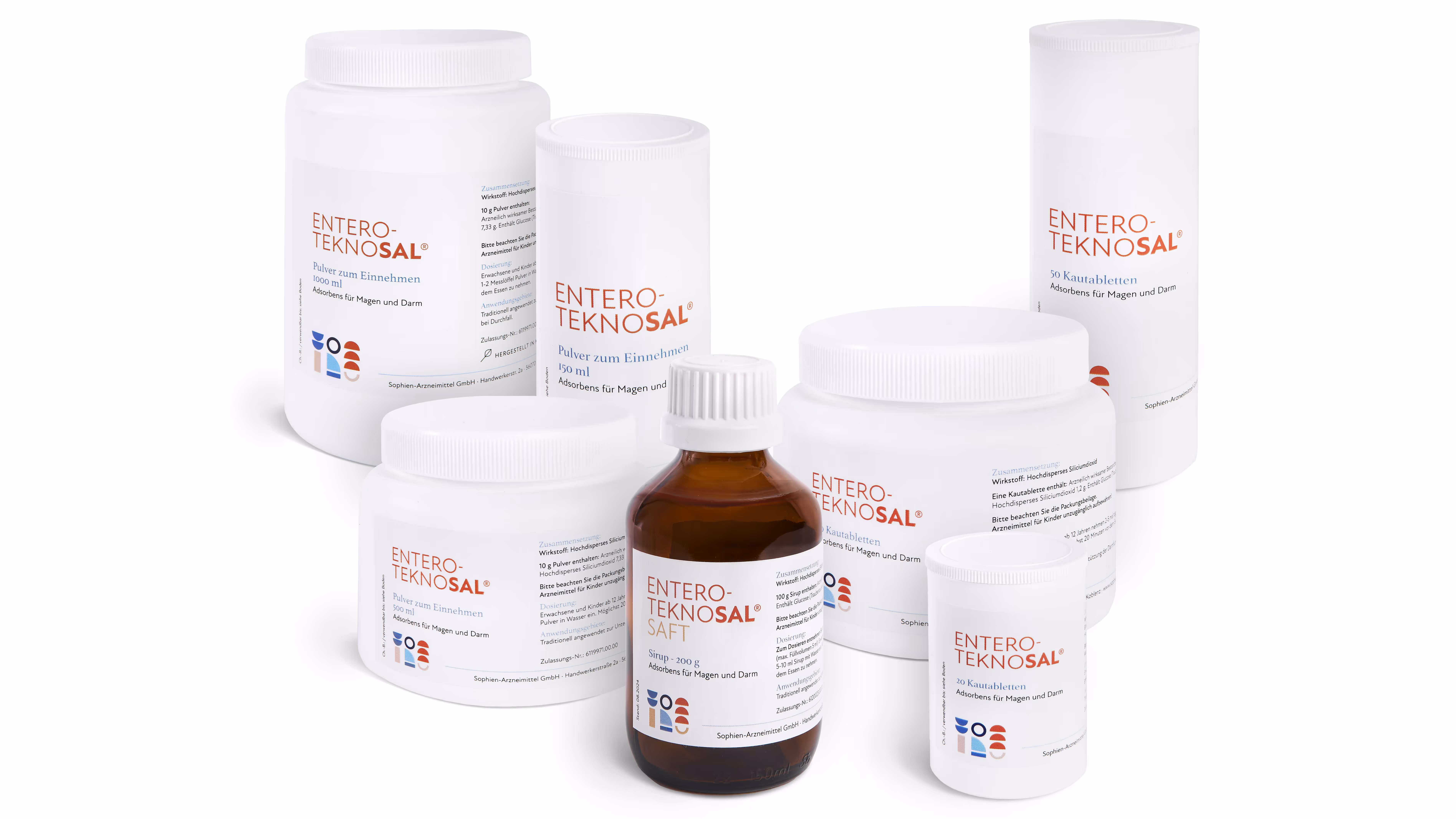
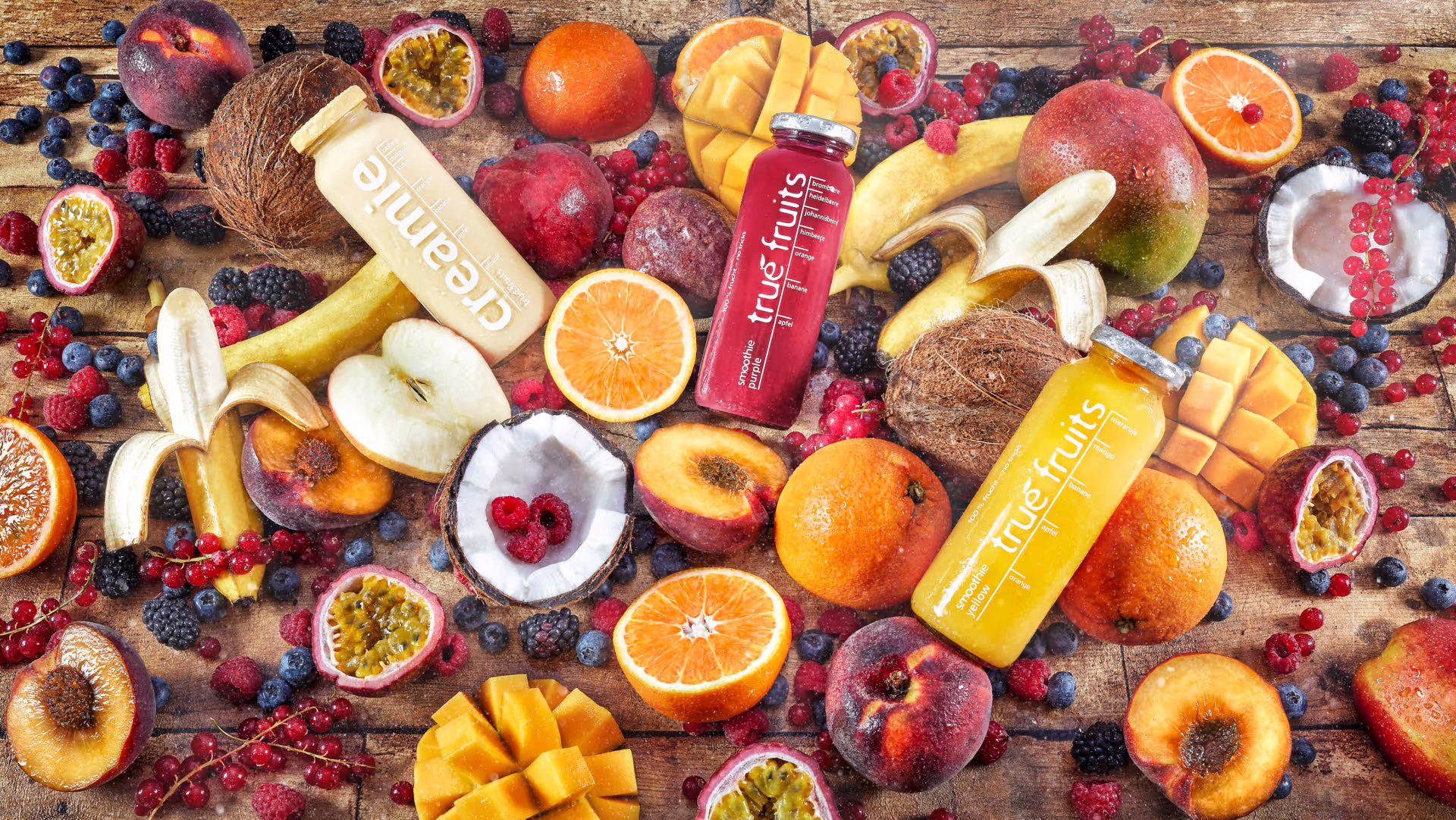
Gallery
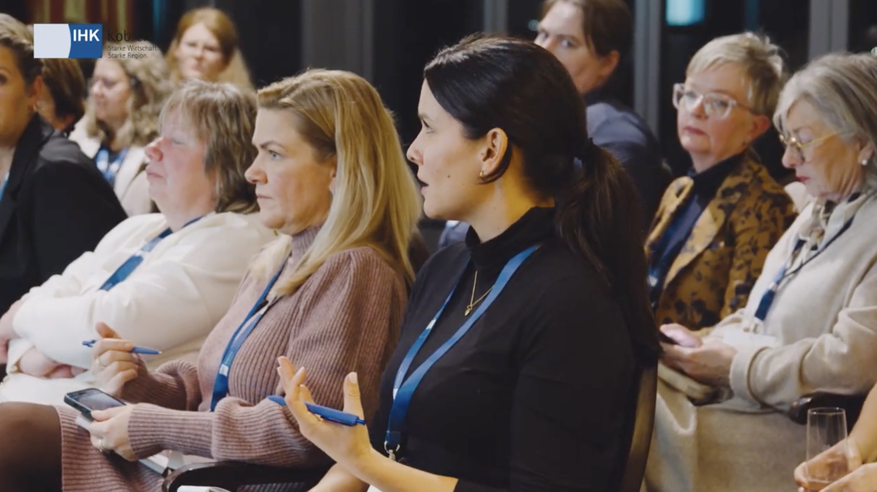
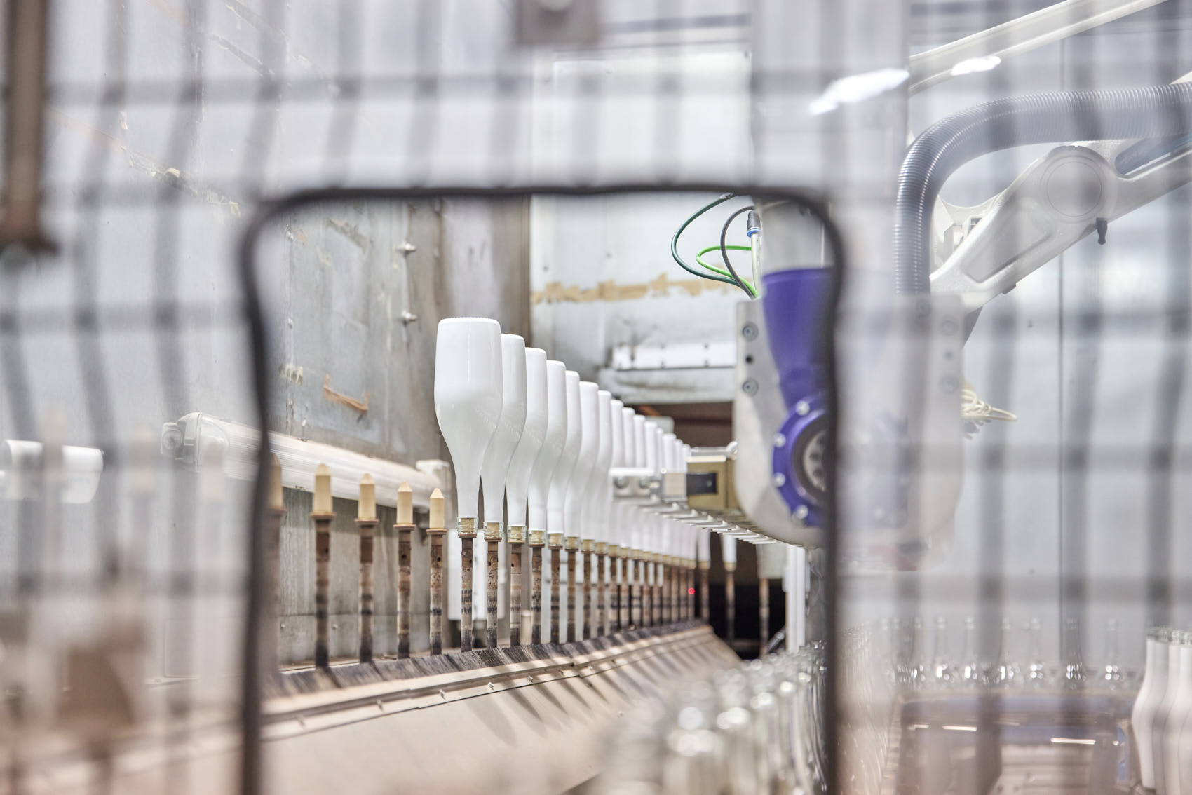
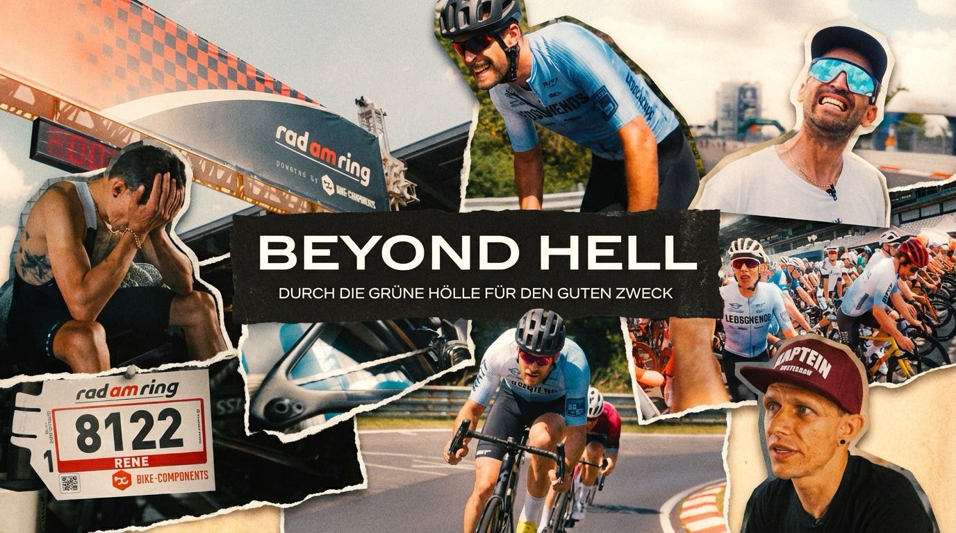
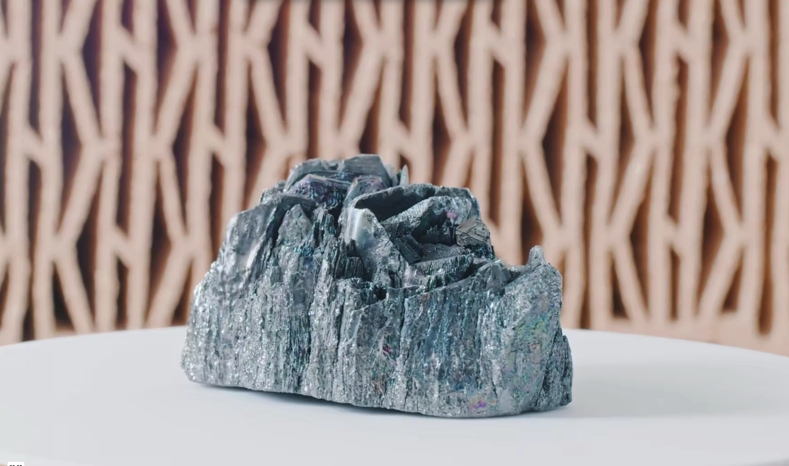
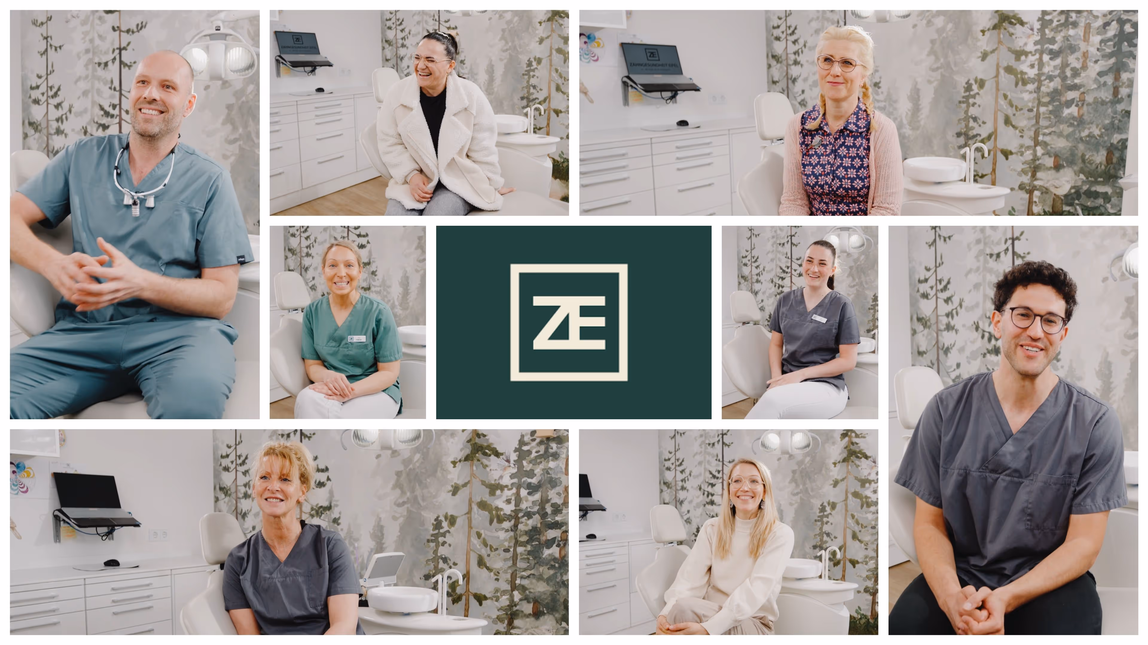
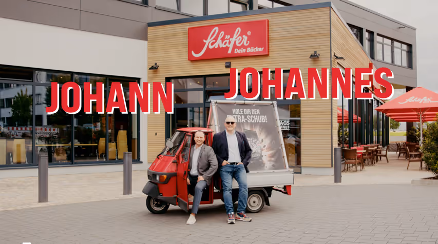
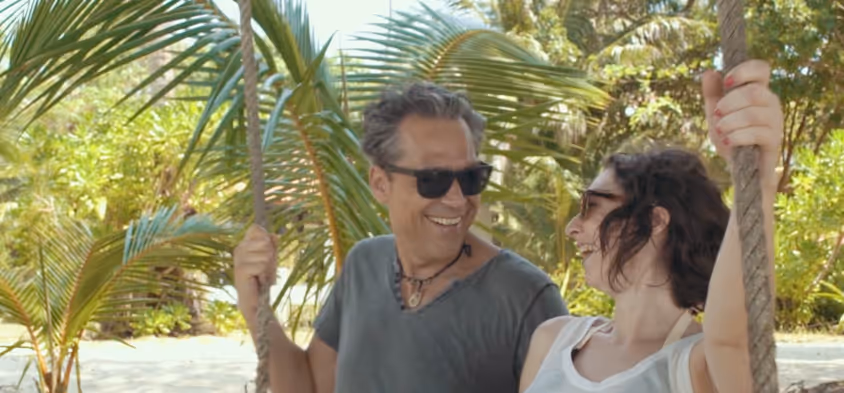
video gallery
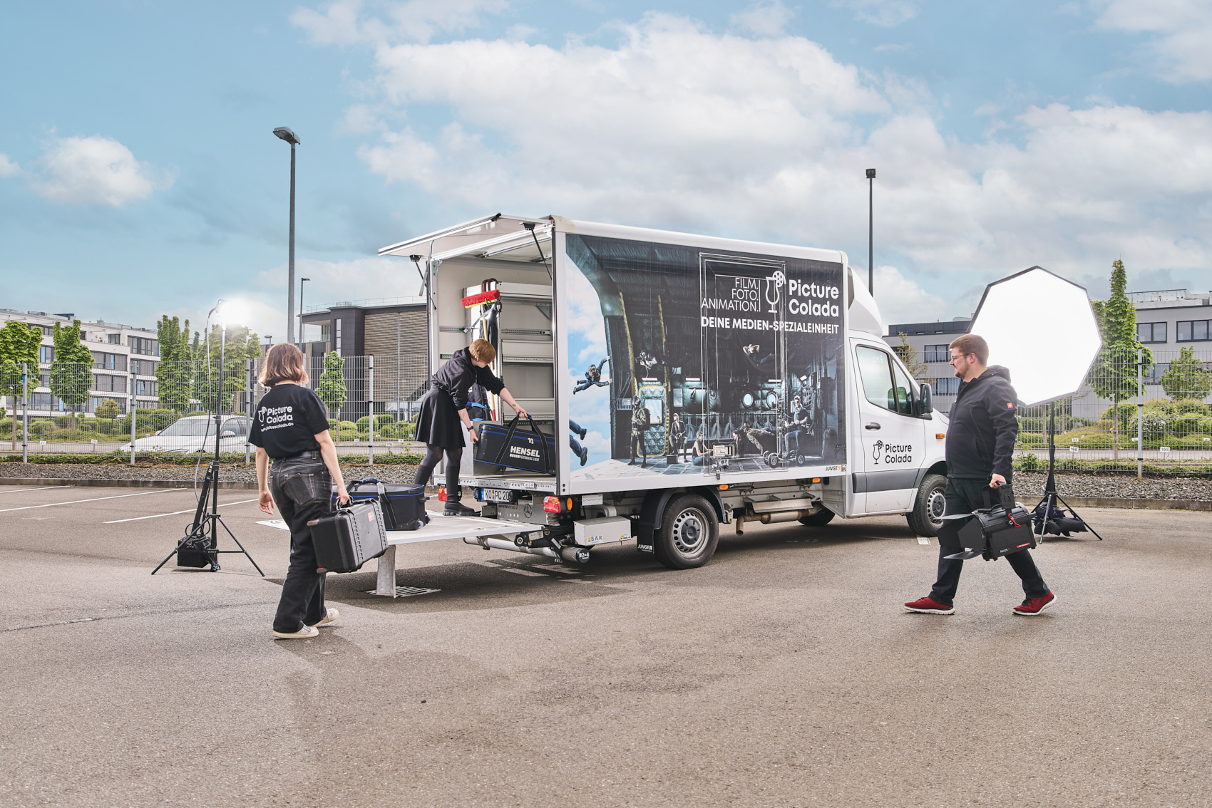
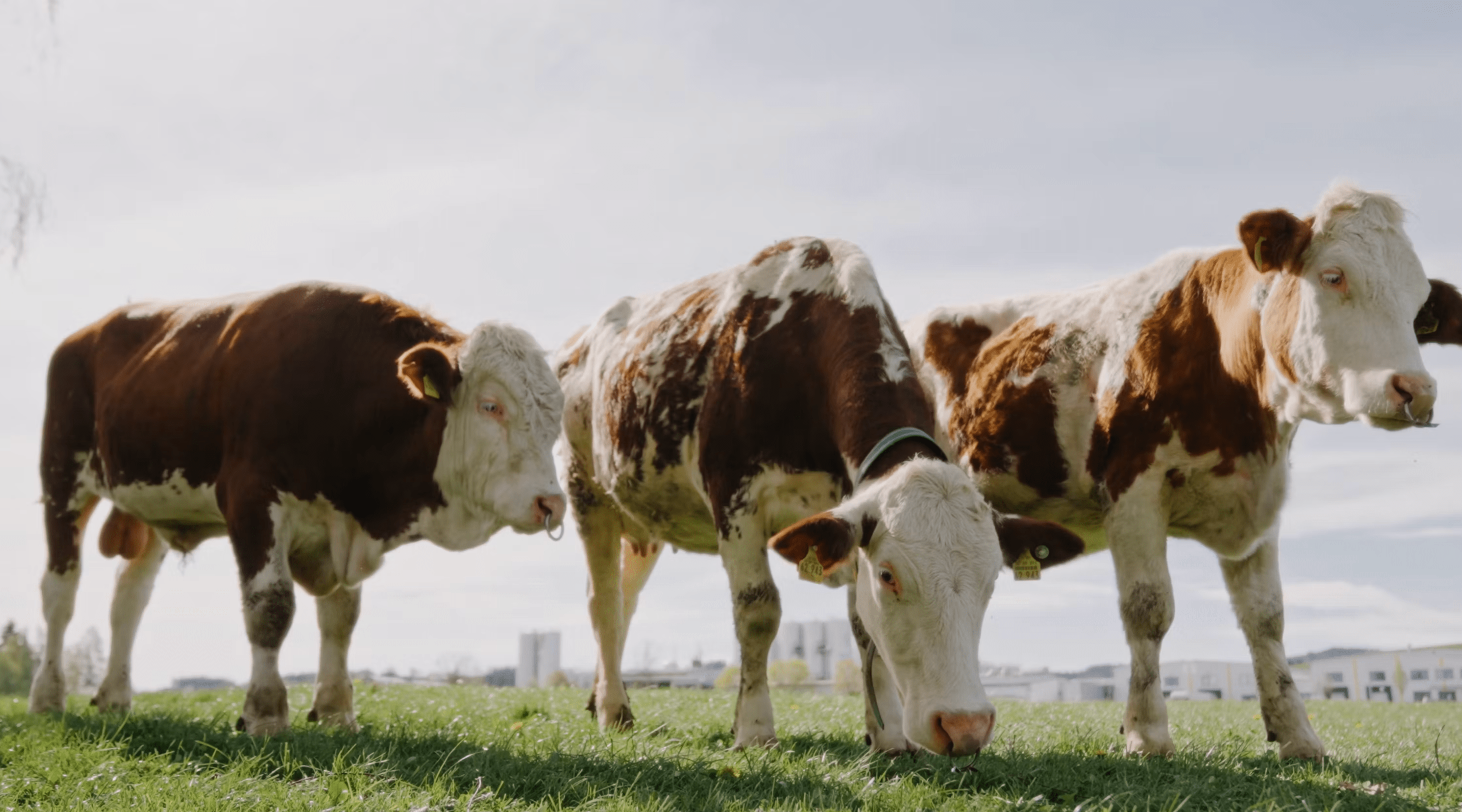
Our latest film projects


.jpeg)
.jpeg)
.jpeg)

.jpeg)

.jpeg)


.jpeg)


.png)


.avif)


.avif)


.avif)


.avif)


.avif)


.avif)


.avif)


.avif)


Interest aroused?
Get to know Paula — the driving force behind it. Get in touch with us for more insights and how we can work together.

Interest aroused?
Get to know Max — the driving force behind it. Get in touch with us for more insights and how we can work together.

Interest aroused?
Get to know Yannick — the driving force behind it. Get in touch with us for more insights and how we can work together.
